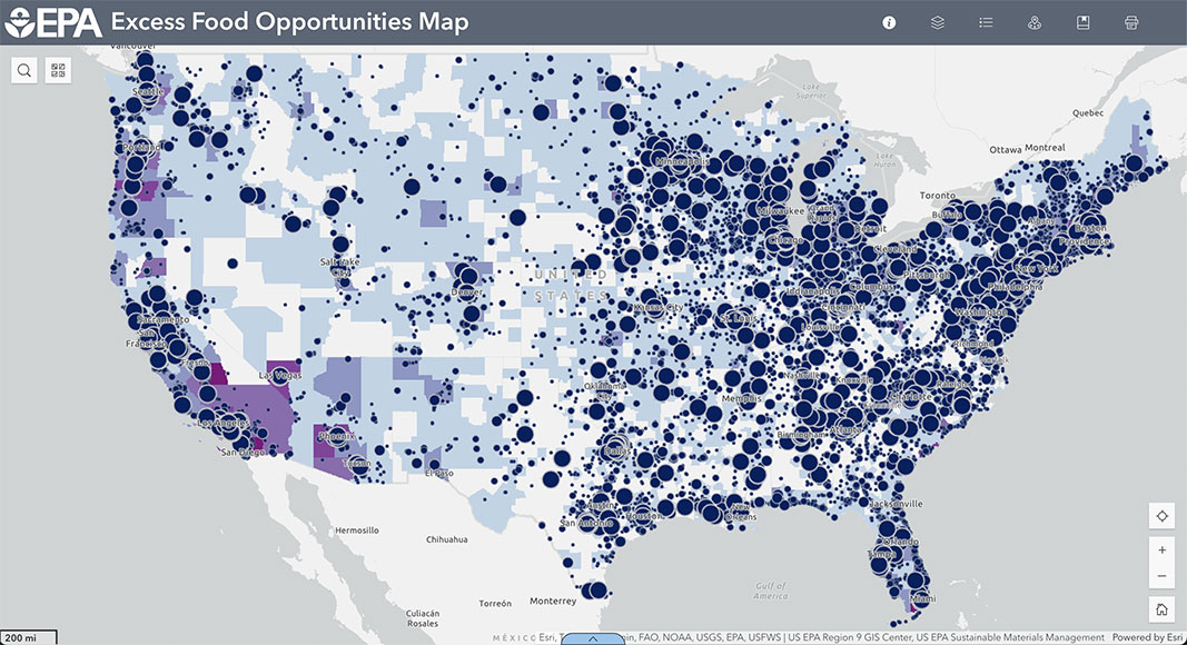
Top: Screenshot of top U.S. food manufacturers and processors proximate to outlets for excess food. All graphics generated from U.S. EPA’s Excess Food Opportunities Map
Juliana Beecher
The U.S. Environmental Protection Agency’s Excess Food Opportunities Map (EFOM) is a publicly-available tool and dataset that provides information on over 960,000 potential generators and almost 15,000 potential recipients of excess food across the U.S. “Excess food” refers to both wholesome, edible food that could be rescued or donated and food waste suitable for composting or anaerobic digestion. The Map was launched in 2018 and has been updated four times since — most recently in March 2025. All U.S. states are included.
Entities considered “generators” of excess food include businesses in the food retail, wholesale, and service sectors; the hospitality industry; healthcare and correctional facilities; schools and colleges/universities; farmers markets; and food banks, food pantries and soup kitchens. An establishment-level estimate of annual excess food generation accompanies geographic and contact information for 89% of generators. These estimates are based on peer reviewed studies of food waste generation in different sectors, and common business statistics such as number of students for schools or number of beds for healthcare facilities. For roughly 11% of other generators, common business statistics or peer-reviewed generation factors (e.g. pounds per student per day) were not available, so excess food generation estimates are not included in the EFOM’s data.
On the “recipients” end, the Map shows composting and anaerobic digestion (AD) facilities, as well as food banks, food pantries, and soup kitchens, which are considered both generators and recipients of excess food. Additional map layers such as Communities with Source-Separated Organics Programs (largely based on BioCycle survey data), Refrigerated Warehousing and Storage, and U.S. Department of Agriculture- (USDA) sourced layers on food assistance, food insecurity and food access provide a hint of infrastructure and socio-economic context to the Map. Information on mapped establishments is viewable in pop-up windows that appear with a click on a mapped point, or in the Attribute Table, which opens from the bottom of the browser window.
Data behind the EFOM comes from publicly and commercially available sources, which the accompanying methodology describes. Most of the data in the current version (3.1) was purchased or compiled in 2021 or 2022. However, the data on food banks, pantries and soup kitchens received a welcome update with the addition of a new data source: Hunger Free America, which operates USDA’s National Hunger Clearinghouse and Hotline. This new data brought the count of food banks, pantries and soup kitchens from fewer than 400 to over 8,400.
The EFOM has many potential uses, some easier to operationalize than others. At its best, the Map provides a high level view of the excess food landscape in a given region. The underlying data can be downloaded as spreadsheet files (.csv) or geodatabase files compatible with GIS software. Though not always the most up-to-date, this data can provide a starting point or verification for other mapping projects. While there are several ways to slice-and-dice the data through the Map’s interface, some users may prefer to download the entire dataset and work with the data in spreadsheet form.
Below, we walk through a few scenarios for which the Excess Food Opportunities Map may be of use. The Map’s User Guide offers more detailed step-by-step instructions for basic navigation.
Assessing Excess Food or Feedstock Availability
The EFOM can be used to assess the potential availability of food for donation or feedstock for composting and anaerobic digestion. This first use scenario (Figure 1) considers identifying potential sites for a new organics recycling facility with the goal of sourcing feedstock from institutions in the southern U.S.: schools, colleges/universities, healthcare and correctional facilities.
In the Layers menu, turn on Top Generators of Estimated Excess Food by clicking the eye icon, then turn on desired sublayers (note that the top layer must be “on” to view sublayers). Establishments will be displayed as dots of varying sizes depending on the amount of excess food they are estimated to generate in tons per year (the larger the dot, the higher the estimate). The range of estimated tonnage that different sized dots represent varies between data layers, as explained in the Legend.
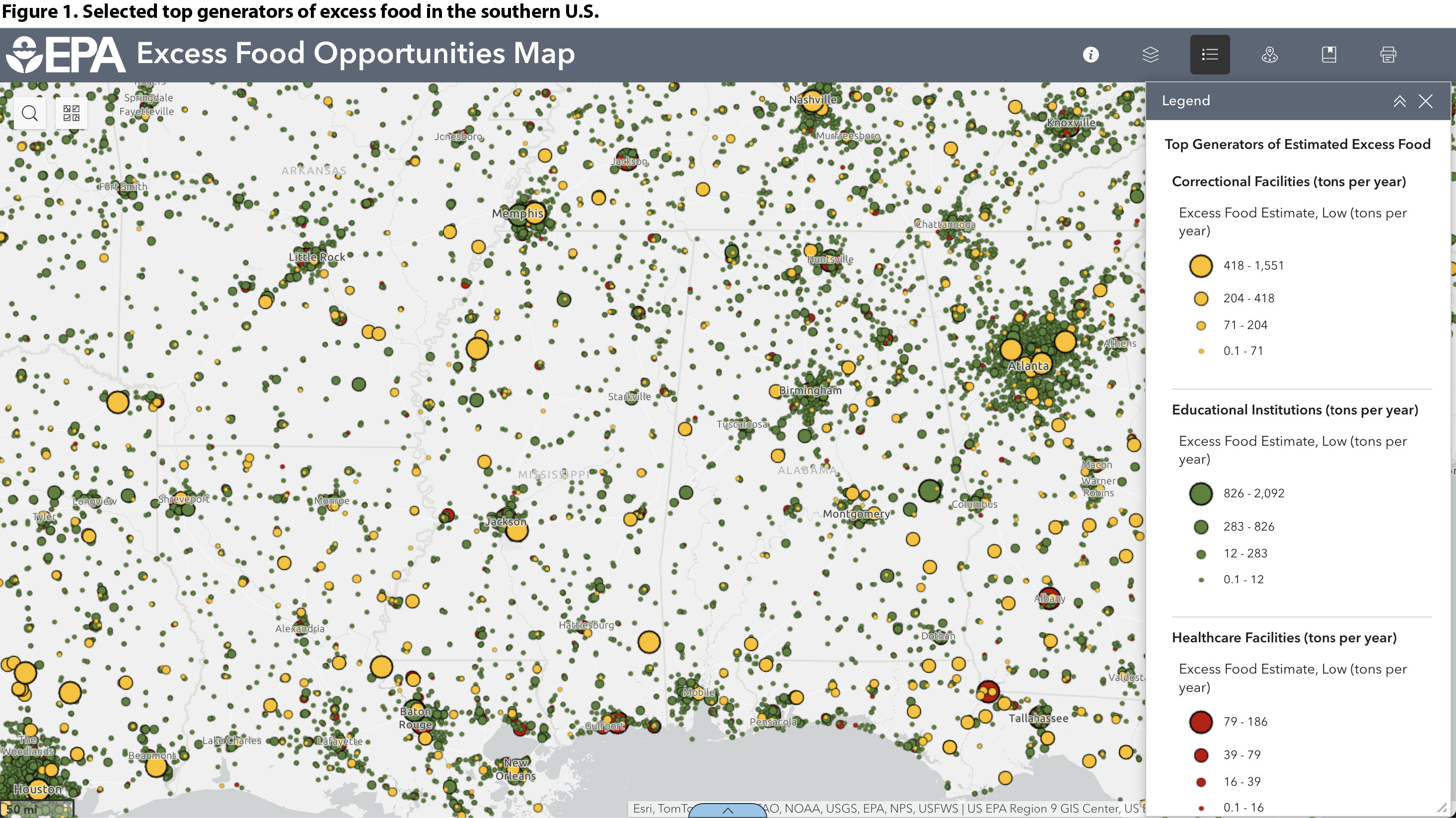
Click to enlarge
To see existing organics recycling facilities (Figure 2), turn on the Composting Facilities and Anaerobic Digestion Facilities layers. Overlaying these two types of information illustrates where food waste is likely generated but gaps may exist in organics recycling infrastructure. For example, Figure 2 shows the southeast corner of Alabama (red circle on left) dotted with small to medium schools and correctional facilities but no organics recycling infrastructure nearby within state lines. Similarly, north of New Orleans (red circle on right) there is a dense cluster of institutions but no nearby composting or AD facilities. Further research on the status of organics recycling infrastructure is always advised, but this kind of overview can provide a starting point in project planning.
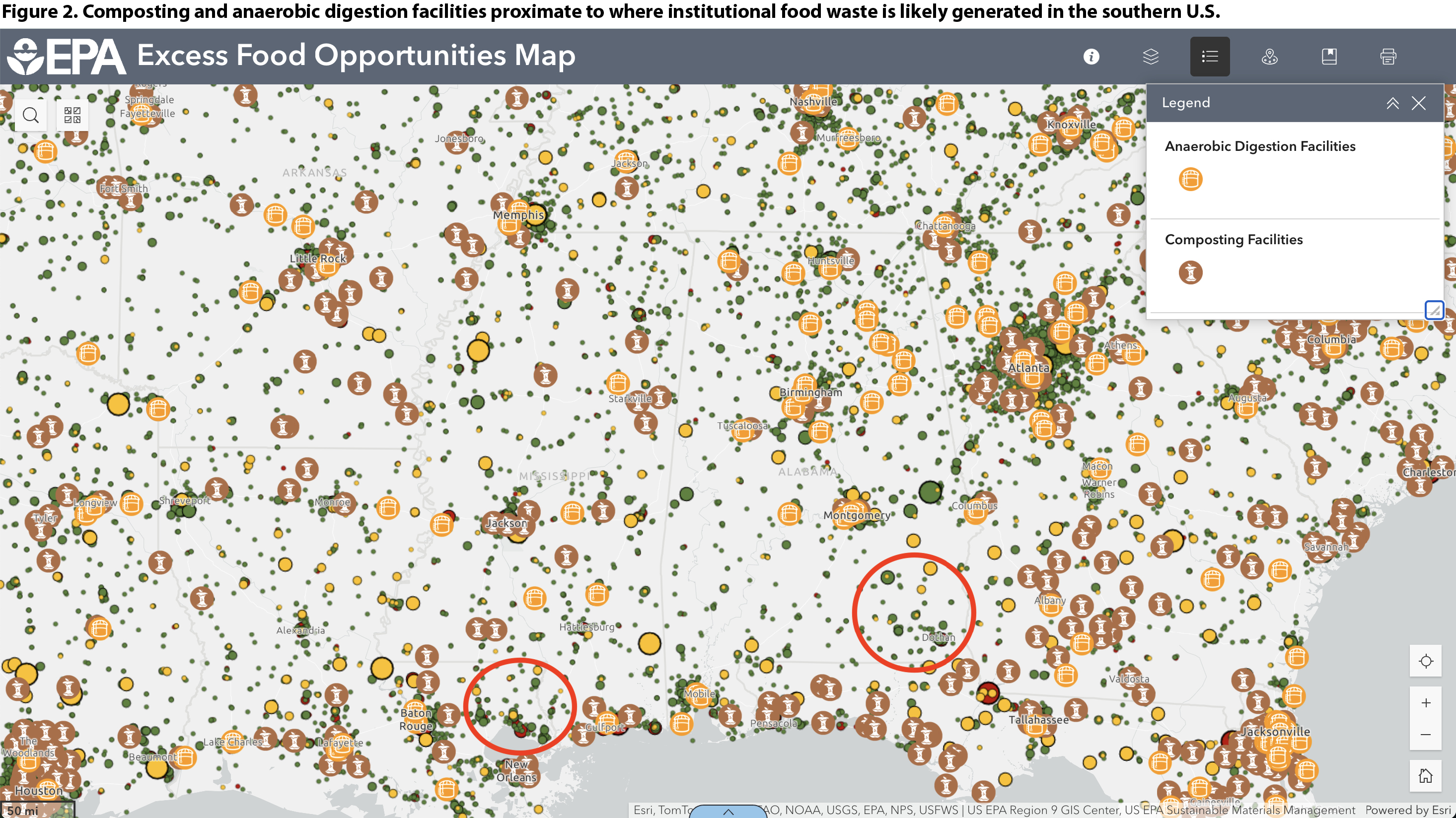
Click to enlarge
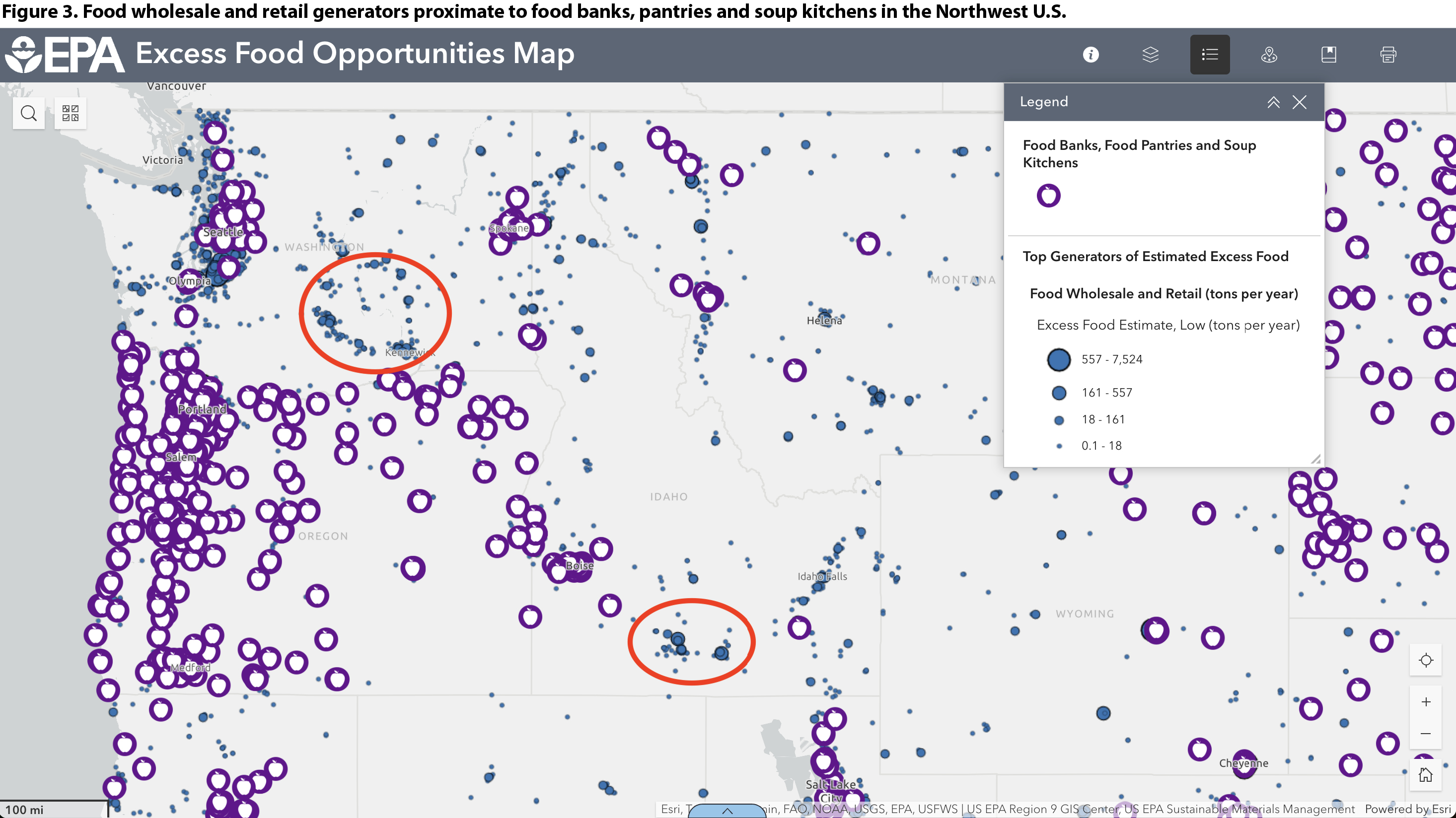
Figure 3 shows another example of this use of the Excess Food Opportunities Map, this time overlaying top generators in the Food Wholesale and Retail sector with Food Banks, Pantries and Soup Kitchens. In southeast Washington state (red circle on top left) and southern central Idaho (red circle on bottom right), the Map shows few hunger relief organizations that could potentially recover and redistribute excess food from the clusters of food retail and wholesale establishments. Based on the size of the dots, there is the potential for thousands of tons of food to be rescued each year in those areas.
A Google search did identify several food banks and pantries in the areas highlighted in Figure 3, further illustrating that the EFOM provides only a starting point, and local verification is a good next step. Note that the Hunger Free America data behind the EFOM Food Banks, Pantries and Soup Kitchens layer is dependent on regular updates from hunger relief organizations and the HFA team. Updates and additions can be submitted directly to the HFA/USDA National Hunger Clearinghouse Database.
Click to enlarge
Assessing Organics Recycling Infrastructure Gaps Using Heat Map Layers
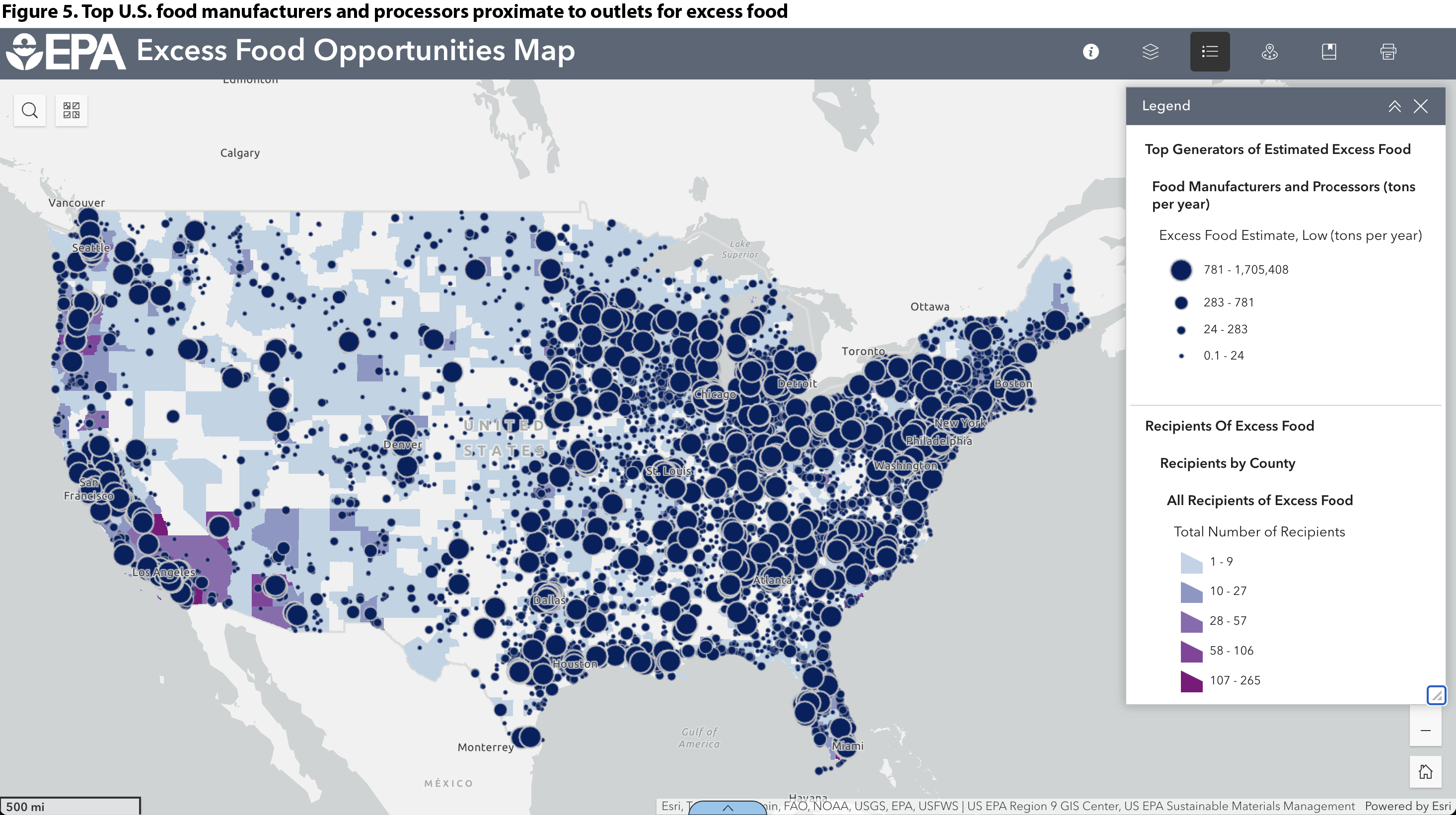
Heat map layers display the number of potential excess food recipients by county or zip code. Under Recipients of Excess Food, turn on Recipients by County or Recipients by Zip Code and the sublayer of interest (Figure 4). This example displays All Recipients of Excess Food by county, including composting, anaerobic digestion, and food banks, pantries and soup kitchens. The darker purple shading shows that southern California, southern Florida, and the Boston area have high densities of recipients of excess food. Note that the shading only indicates the number of potential recipients, not their capacity to accept or process excess food.
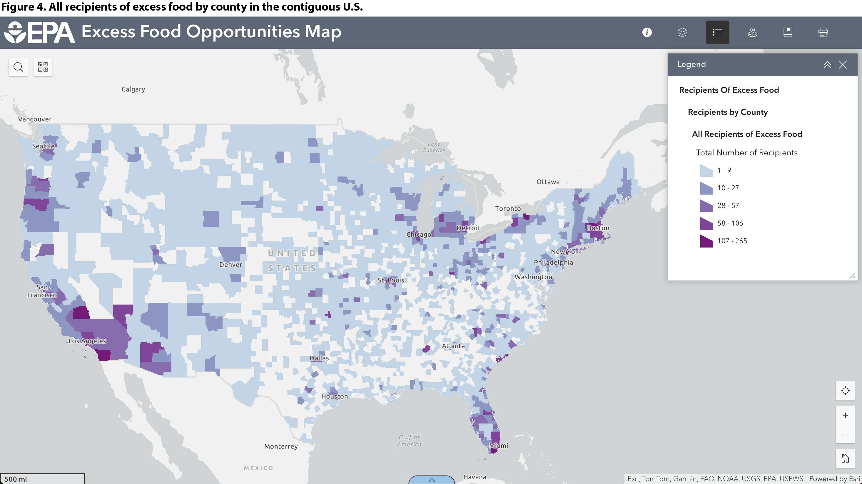
Click to enlarge
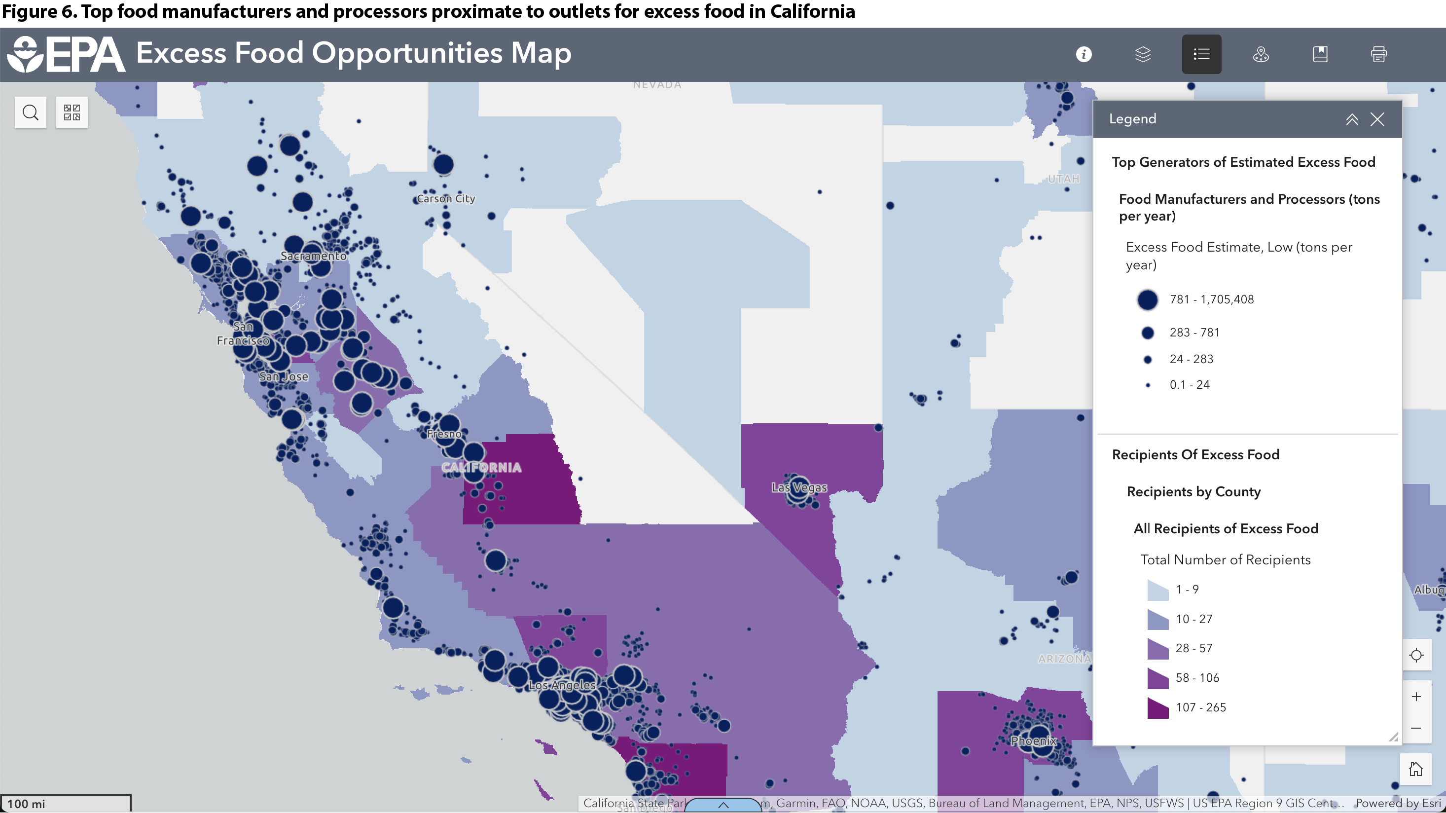
Next, overlay top generators in Food Manufacturers and Processors (tons per year) to see areas with food manufacturing but few excess food rescue or recycling options (Figure 5). Figure 6 provides a more zoomed-in view of the same layers.
Click to enlarge
Click to enlarge
The zoomed-in view (Figure 6) shows that northern California has fewer outlets for excess food generated by manufacturers and processors than counties in southern California and neighboring Arizona and Nevada. Of course, those manufacturers may have other outlets for their food waste and byproducts that are not represented in the EFOM data, so further investigation is advised.
Estimating Number of Entities Affected by Regulation
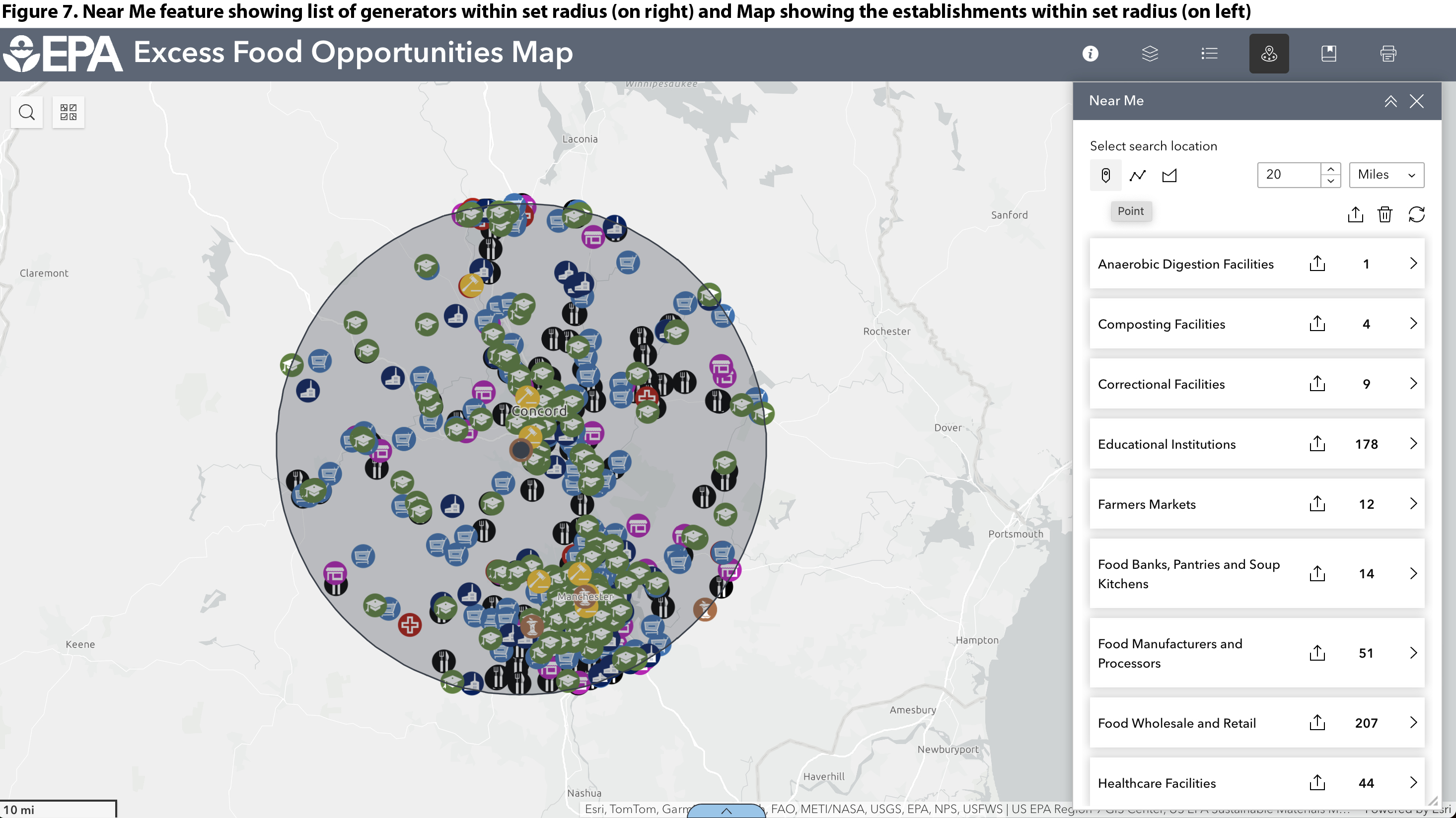
Another use of the EFOM is to help assess the number of entities that may be subject to laws banning the disposal of food waste in landfills or incinerators. Organics bans or landfill diversion requirements (regulations that require certain generators to donate and/or recycle excess food) usually apply to entities generating a minimum amount — for example, one-half ton per week. Such laws often provide exemptions for generators outside a specified radius or road miles of an organics recycling facility — usually 20 or 25 miles.
The Map can help identify how many potential excess food generators may fall within a radius, are estimated to generate a minimum amount of excess food, and thus may be subject to diversion requirements. Currently, 10 states (New Hampshire, Vermont, Massachusetts, Rhode Island, Connecticut, New York, New Jersey, Maryland, California and Washington state) have bans in effect or going into effect. Several local governments also have food waste disposal bans.
We will use Concord (NH) in this example of identifying excess food generators located within a set radius of a single organics recycling facility. Turn on the Composting Facilities layer. Using the Near Me feature, drop a pin on a facility, then set a radius (Figure 7). In this case, the pin was dropped on a composting facility in Concord and the radius was set to 20 miles. The Map and the Attribute Table, which pulls up from the bottom of the browser window, can both be used to display food waste generators within a 20-mile radius of the composting facility. Generator layers (Hospitality Industry, Food Wholesale and Retail, etc.) can be turned on to display establishments on the map, but the list in Near Me and the Attribute Table will be populated even if those layers are not turned on in the Layers list.
Click to enlarge
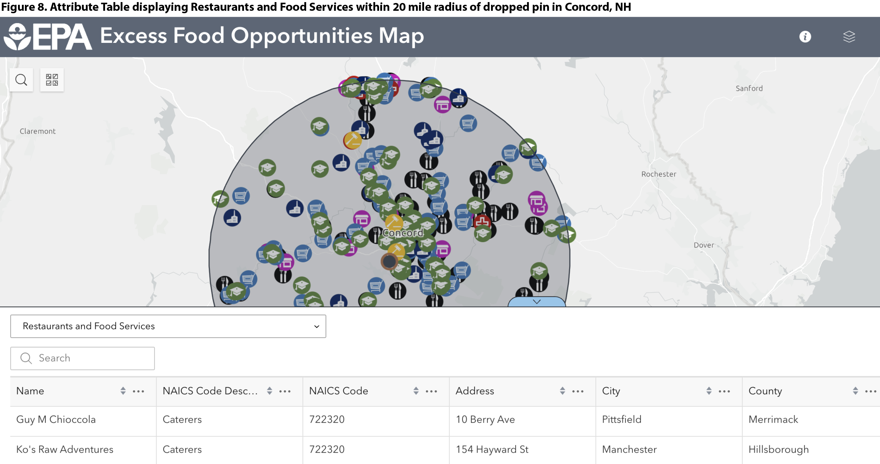
From here, data can be exported as a .csv file for each layer by clicking the Download icon to the right of the Layer name in the Near Me list. It’s possible to additionally filter the list of generators within this radius by estimated amount of excess food generated per year, which is another common factor in determining which entities are required to divert food waste. For example, New Hampshire’s food waste disposal ban requires entities generating over 1 ton per week (or 52 tons per year) to divert.
To further filter by generation estimate, open the Attribute Table and select the layer of interest from the drop-down menu (Figure 8). It’s only possible to view and export data for one layer at a time in the Attribute Table.
Click to enlarge
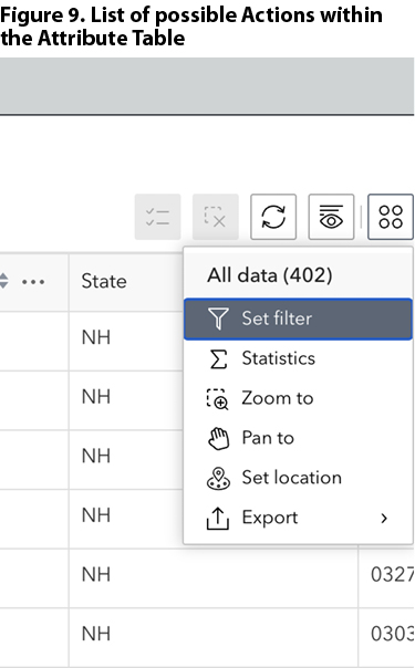 Select the Actions icon at the far right (four dots) and select Set Filter (Figure 9), then click Add Clause. Outline the parameters of the desired data, as shown in Figure 10, and toggle the filter “on” in the top right corner of the Set Filter window. Figure 10 shows a clause that will filter for Restaurants and Food Services estimated to generate at least 52 tons per year (an average of 1 ton/week), according to the high estimate for excess food generation. More detailed directions for setting filters are available in the EFOM User Guide.
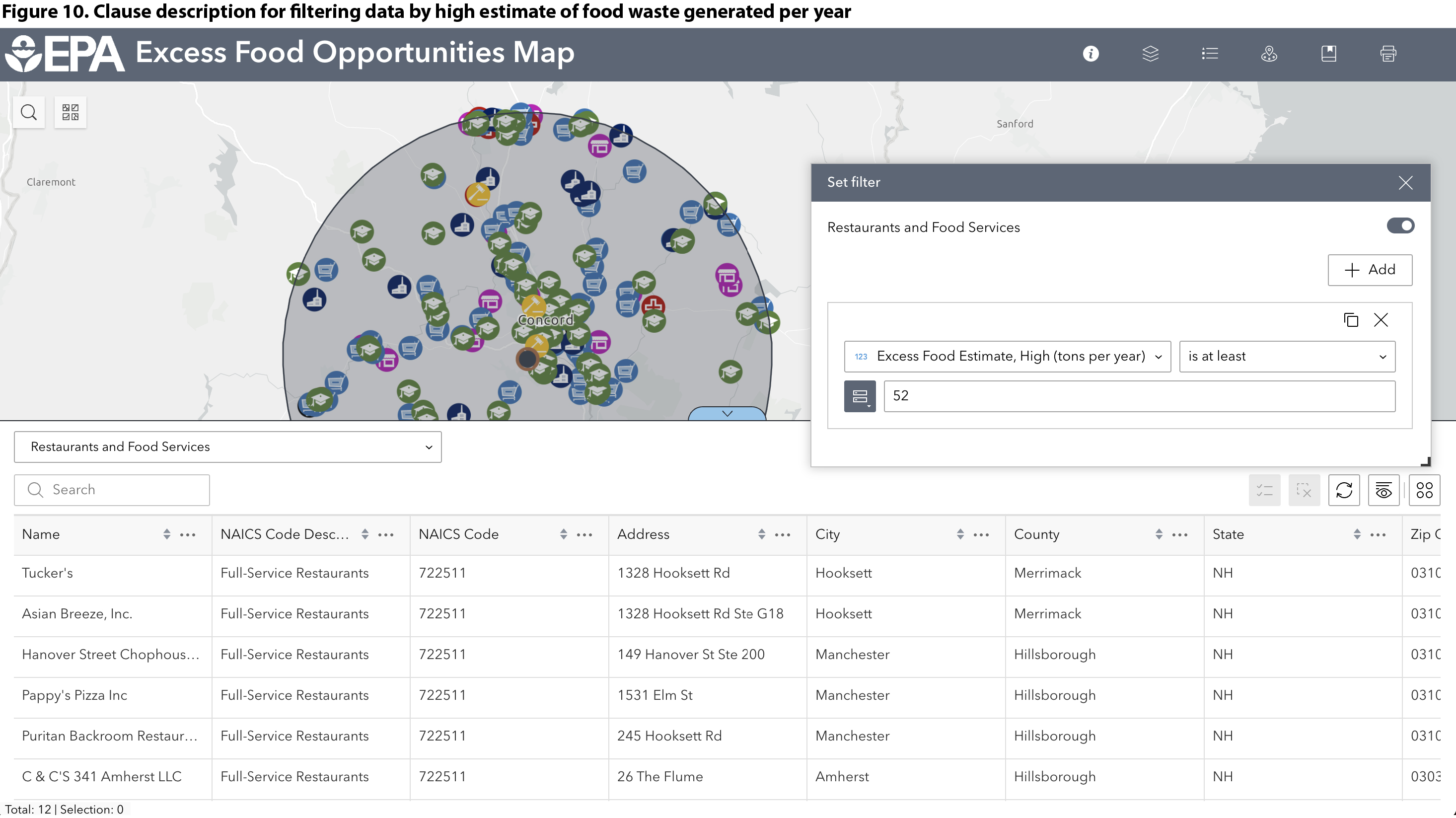
The list now displayed in the Attribute Table (Figure 10) includes only Restaurants and Food Services that fall within 20 miles of the pin dropped on a composting facility and are estimated to generate at least 1 ton/week of excess food (by the high estimate). By New Hampshire’s law, which took effect Feb. 1, 2025, those generators may be required to comply with the state’s food waste disposal ban if the receiving organics facility has capacity and is permitted to accept food waste.
Exporting Spreadsheet Files of Filtered Data
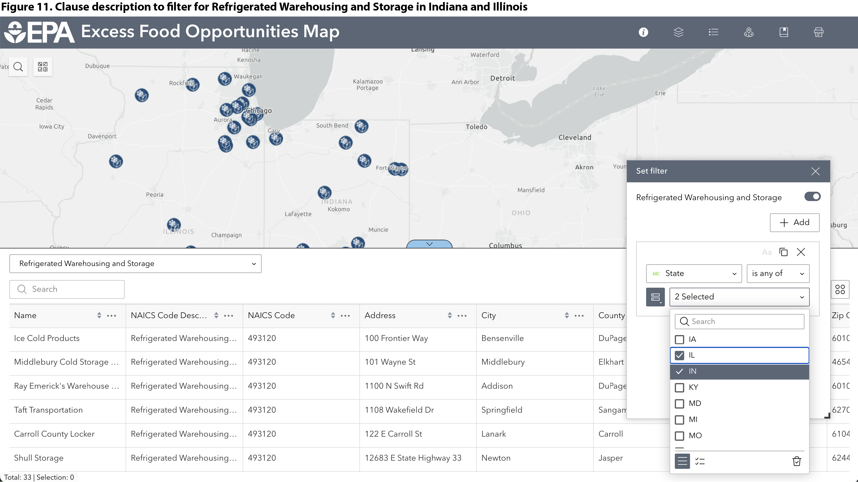
A full dataset download is available through the EPA’s Geoplatform. The download includes a spreadsheet (.csv file) for each data layer plus geodatabase files. Data for a single layer or a filtered list can be exported and downloaded using the Attribute Table. In this scenario, we create a list of Refrigerated Warehousing and Storage Facilities in Indiana and Illinois. This same set of steps can be used to generate a list of all composting facilities in a county or all anaerobic digestion facilities in the Mid-Atlantic states, for example. In the Attribute Table, select the Refrigerated Warehousing and Storage layer from the drop-down menu. Click on Actions on the right, then Set Filter. Add a clause, set parameters to filter by state for Indiana and Illinois, and toggle the filter “on” (Figure 11).
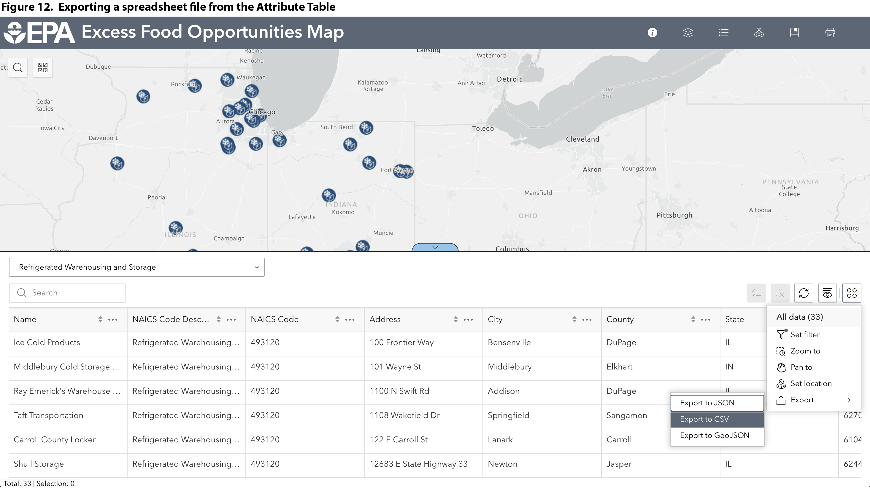
To export a spreadsheet of the filtered list, click Actions again (four dots icon on top right of Attribute Table), then hover over Export and select Export to CSV (Figure 12). Short of downloading the entire dataset, this is the best way to download individual data layers or filtered lists from the Excess Food Opportunities Map.
Other Tips
Important! It is not recommended to view the Map on a mobile phone!
The Excess Food Opportunities Map is backed by a large and somewhat unwieldy dataset. The EPA updates the data when time, staff resources, and contracts allow. The agency prefers to update entire data layers at once rather than editing single data points (e.g. adding an individual composting facility or updating a restaurant’s address). The EPA also prefers to work with national datasets, rather than piecing together state and local data (though that kind of compilation generated the Map’s lists of composting and anaerobic digestion facilities).
The EFOM’s user guide, technical methodology, and FAQ provide more information. For questions on the Map or to share stories of its use, email smmfood@epa.gov.
Juliana Beecher, a Contributing Editor to BioCycle, is a former ORISE Research Fellow with the U.S. EPA’s Office of Resource Conservation and Recovery. Now working as a consultant based in Portland, Maine, Juliana brings the food waste perspective to broader food systems conversations and efforts to build a more resilient food supply chain.